Thursday, November 4, 2010

Inspirational light artists

As I was doing research on different light artists I came across the website of Alejandro and Moira Sina.
Electricity, glass and luminous gases are part of the palette they use to create ethereal kinetic works with light and color, exploring art and technology interaction. Their body of work includes the following forms:
  • Indoor and outdoor installations
  • Large scale suspended clusters
  • Kinetic Lightworks
  • Interactive Lightworks
I find their works very inspiring. Soap bubble

I Love Love Love anything by Olafur Eliasson, he is a genius and very inspirational. Here are some of his works: eliasson-beautyolafur eliasson by thomas hawk

Wednesday, November 3, 2010

Luminaire Inspiration Light Artist

For our luminaire project each student was given a number.  Each number represents a light artist.  My number was representing James Turrell a famous artist whose specialty is light and space.  This photo was taken in Arizona.  He acquired this land out in Arizona, because of the Roden crater which he found inspiring.  I myself love the american southwest with its beautiful sunsets and the different colors that can be found in the region.  I love this photo, because it captures so much, it's such a peaceful and warm photo.

Monday, October 25, 2010

Parti (Inspiration Board) For Stick Project

For my Parti board I looked for inspiration through magazine ads and editorials.  My inspirations were transcending from darkness to lightness.  I looked for scenes of nature, and anything related to it.  It turned out to be very useful when working on my stick project.

Wood Project

The process of making my wood project.

The process of making my wood project was very much jigsaw puzzlesque.  By sanding down the original pieces and fitting them together in a grid-like form to create one giant structure.

Light Inspiration Board

This was the photograph I originally took as the inspiration for my light board.

Starting the process I went through many ideas of how to create my board, many trials and errors.
Using a glue gun and acrylic paints as well as popsicle sticks I created my light board.

This was the final product of my hard work.  Taking the popsicle sticks I cut the ends off and painted them to look like window blinds.  Then using cotton I created a 3-D effect making my blinds look realistic and project from the board.  I then used a plastic water bottle to do my abstract model of the original glass mosaic container.  Cutting the plastic bottle to create a vortex like appearance that the light gives off within the original photo.  I also painted it with warm colors that were found within the photo.

Wednesday, October 13, 2010

Stick project


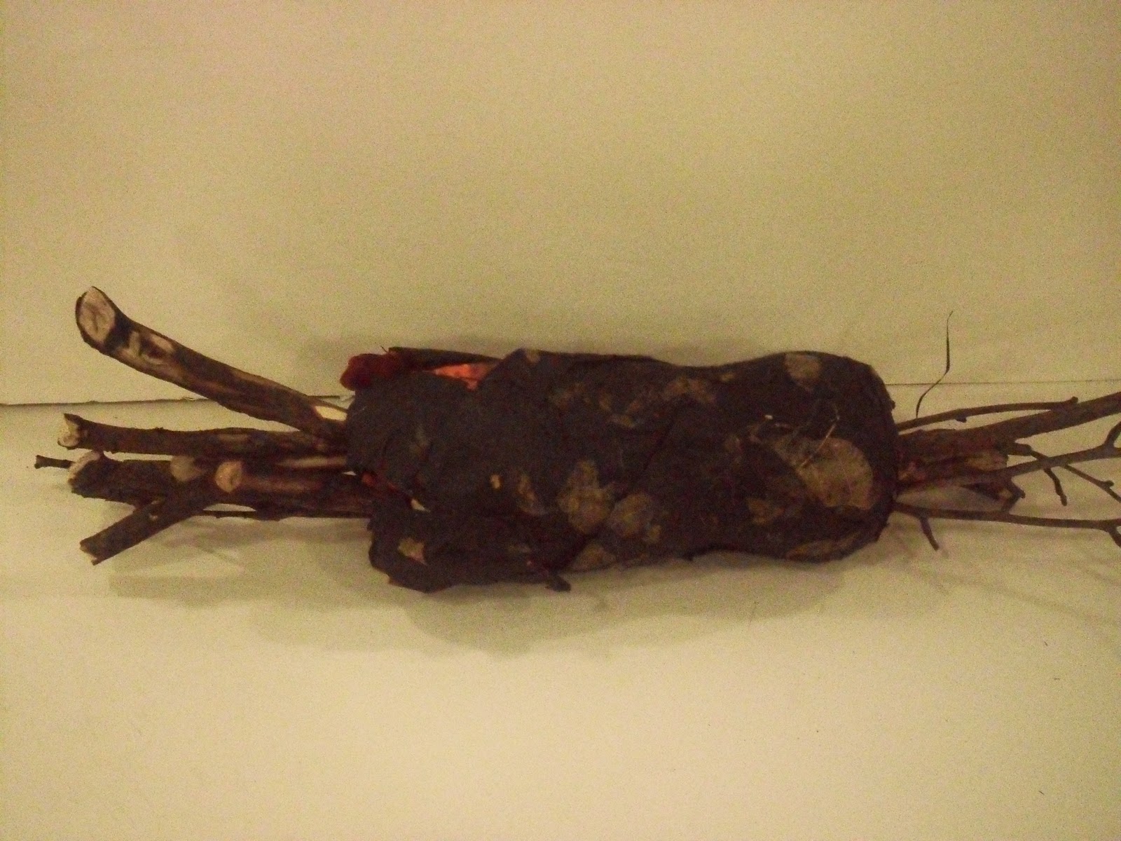
When starting the stick project the class was given instructions for creating a place/container for 12 sticks.  The sticks could be of any variety as long as there were 12.  Each stick could be no longer than 18'' in length.  The materials we could use to create this place for the sticks could be made up of paper, and one fastener.  That day I went out to observe different sticks in nature to see where I could draw my inspiration from and find some sticks I connected with.  I came back to the studio with two hand fulls of many different varieties of sticks ranging from birch, to willow, etc.  Many different sizes from twigs to thicker, longer sticks.  I also went to the local art supplies store and started looking at different types of tissue paper, I knew I wanted to do paper mache as my container for the sticks.  I evenutally came across a very unique paper that caught my eye.  It was a dark smoky paper with pressed dryed leaves made in with the tissue paper.  I thought "wow this paper is amazing, it is very nature oriented, and mysterious."  Later that night I went home and made myself a workspace to start with the paper mache process.  I took a plastic coke bottle, sawed off the top and made my paper mache concoction of flour, salt, water, and some baking soda.  Mixing it all together till it became a thick paste form.  I then dipped strips of newspaper that I cut up forming them around the bottle.  when the base of the paper mache was finished drying I then took the tissue paper and covered the newspaper form with it.  I also created giant loops around the top and braided tissue paper coming from the bottom of the container.  I wanted the project to have a very woodsy smoky almost campfire look to it.  So I took the smaller twigs and burnt the ends of them to give the wood a charring effect.  I then had sticks sticking out both sides of the container.  This would give the container a way to be propped up to give a floating appearance. 

For the project we were instructed to do a Parti, which is a term derived from the french meaning "to make a decision" often referred to as The Big Idea.  The parti is thought to be the chief organizing thought or decision behind an architect's design presented in the form of a basic diagram and/or a simple statement.  For my parti, I did a collage of different magazine cutouts I found to give me inspiration for my project.  I found many things that were very eyecatching, I loved the idea of a dark forest full of mystical things, almost like the Grimm's fairytales.  I also had elements of dark to light, as well as fire, carvings, woods, textures, and colors.

After the first critique, I realized I had way too many ideas going on with my container.  So I went back to simplify my project and concentrate more on this campfire feel it had.  I then removed all the ringlets and braids. I also purchased some bright orange india ink to paint the inside and edges of the newpaper that was showing  to give an inferno-like appearance.  The overall projection was to give the idea that some kind of powerful heat source was building inside the object and the sticks were jutting out the sides to help fuel this energy inside.  I also took a knife and carved some of the sticks to give a chipped effect like firewood that had been gathered from the forest.  My end product went well, but looking back at it, I feel that I should have used a different object rather than the original plastic bottle.  If I had it to do over again I would have used a much larger circular object like a balloon to create the base from paper mache  to give an almost explosive effect.

Wednesday, September 15, 2010

Leaf Project

When starting the leaf project, our first project of the semester, we were brought the challenge of making a place for a leaf.  Using any kind of leaf that we found interesting we were to create this place using only a 12.5X12.5 in. sheet of white paper and no fasteners.  Thinking of all the possibilities I could do with this paper I had many ideas to work with.  My first thought was to manipulate the paper creatively so that the paper was very abstract and related to the leaf in some way.  My first attempt was cutting the paper into long thin strips and braiding the strips of paper leaving 1/4 of the paper all connected to a solid piece.  I then took the solid end and folded it inward to create a circle with the braided ends sticking up in the air.  I then bent every other braid down into the bottom circular piece.  creating a "nest" for the leaf and bending the other piece above and around the leaf.  After realizing it was too much going on and that it didn't relate completely to the leaf, I needed to go back in and simplify, yet perfect what I had done.  My second attempt I used a thicker stronger piece of watercolor paper.  I then cut the long strips completely separating them.  I then decided to do a basket weave with the strips creating a box with loose straight ends putting the leaf in the middle.  The problem with the box is that it was too large of a space for the leaf, for my leaf was rather small and starting to curl a little at the edges due to drying.  So I needed to scale down my box so that there wasn't so much negative space around the leaf, making the leaf the main focus.  I then deconstructed the box and used only a portion of it and using the loose ends to weave and construct an almost basket-like form for the leaf.  My project was wide at the bottom and then became smaller at the top of the ring-like structure.  I then took the ring and manipulated it in a curved manor to represent the leaf's curvature.  I took the leaf from its stem and fastened in in the top thin part of the structure so that the body of the leaf curved with the paper structure in a fluid motion.  The ending product had texture due to the paper as well as the folds from the weaving.  Some of the holes within the weaving of the paper also help represent some of the holes in the leaf.  The finished product stood very well in its effort to be a place for my leaf that helped relate and represent the leaf as well.