During this fall semester I have learned alot of varieties of drawing techniques and shading. This has definitely helped me develop my drawing abilities, because before this year I didn't really have much experience with drawing and sketching. I have to say I have been surprised with myself so far.
For this observational sketch, we were drawing types of food. Holly my fellow classmate had made these delicious chocolate cupcakes with white icing and green sprinkles. Before consuming such a yummy treat, I sketched it, to add a sense of scale to the drawing I positioned my boot in the picture. No worries though, I was very careful not to get any dirt on my cupcake.
With this sketch, we were to do self portraits and sketches of ourselves, so I played around with shading and was trying too hard to focus in the mirror, overall I did ok, I can see where I could use improvement in drawing features, because they are so complex. I felt my sketch was stronger without doing and actual face outline and angling my head differently.
This sketch was just something for fun, I had just been introduced with charcoal and drawing with it. So I did this tape dispenser. I tried to capture the lighter parts where the light hit and tried to go darker with tones in the more shaded areas. I feel overall pretty good about this sketch, considering I was just doing this for fun. After I had done this sketch I actually learned about tonal drawing and how to capture the dark and light tones in a drawing to help create a more 3-D effect


This is actually apart of choosing a two pages from another classmate that we find interesting. I chose Paige, because I have observed throughout the semester she is a really good drawer. She pays attention to detail and shading. From this picture you can tell she picks all kinds of subjects to draw in a variety of ways. I found this drawing fascinating, because of the composition. When you first glance at it, you are not quite sure what you are seeing but you eyes are drawn all around the page by the repetitive lines, the diagonals within the drawing and just the shapes. The second drawing is just very interesting because it is a very animated picture with exaggerated features that keep the viewers eye. her use of shading and definition are very good and she payed alot of attention to details.


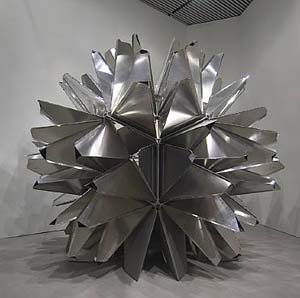
 As I was doing research on different light artists I came across the website of Alejandro and Moira Sina.
 Soap bubble


 The process of making my wood project.
  The process of making my wood project was very much jigsaw puzzlesque. By sanding down the original pieces and fitting them together in a grid-like form to create one giant structure.
 This was the photograph I originally took as the inspiration for my light board.
 Starting the process I went through many ideas of how to create my board, many trials and errors.
 Using a glue gun and acrylic paints as well as popsicle sticks I created my light board.
 This was the final product of my hard work. Taking the popsicle sticks I cut the ends off and painted them to look like window blinds. Then using cotton I created a 3-D effect making my blinds look realistic and project from the board. I then used a plastic water bottle to do my abstract model of the original glass mosaic container. Cutting the plastic bottle to create a vortex like appearance that the light gives off within the original photo. I also painted it with warm colors that were found within the photo.
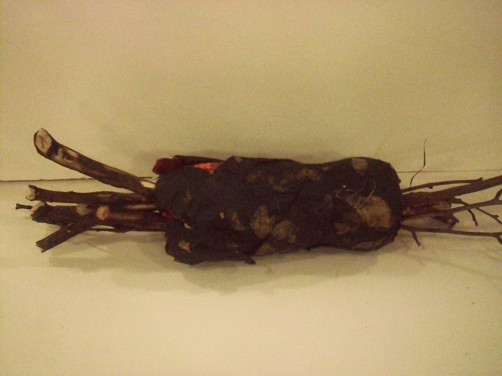 When starting the stick project the class was given instructions for creating a place/container for 12 sticks. The sticks could be of any variety as long as there were 12. Each stick could be no longer than 18'' in length. The materials we could use to create this place for the sticks could be made up of paper, and one fastener. That day I went out to observe different sticks in nature to see where I could draw my inspiration from and find some sticks I connected with. I came back to the studio with two hand fulls of many different varieties of sticks ranging from birch, to willow, etc. Many different sizes from twigs to thicker, longer sticks. I also went to the local art supplies store and started looking at different types of tissue paper, I knew I wanted to do paper mache as my container for the sticks. I evenutally came across a very unique paper that caught my eye. It was a dark smoky paper with pressed dryed leaves made in with the tissue paper. I thought "wow this paper is amazing, it is very nature oriented, and mysterious." Later that night I went home and made myself a workspace to start with the paper mache process. I took a plastic coke bottle, sawed off the top and made my paper mache concoction of flour, salt, water, and some baking soda. Mixing it all together till it became a thick paste form. I then dipped strips of newspaper that I cut up forming them around the bottle. when the base of the paper mache was finished drying I then took the tissue paper and covered the newspaper form with it. I also created giant loops around the top and braided tissue paper coming from the bottom of the container. I wanted the project to have a very woodsy smoky almost campfire look to it. So I took the smaller twigs and burnt the ends of them to give the wood a charring effect. I then had sticks sticking out both sides of the container. This would give the container a way to be propped up to give a floating appearance.
  After the first critique, I realized I had way too many ideas going on with my container. So I went back to simplify my project and concentrate more on this campfire feel it had. I then removed all the ringlets and braids. I also purchased some bright orange india ink to paint the inside and edges of the newpaper that was showing to give an inferno-like appearance. The overall projection was to give the idea that some kind of powerful heat source was building inside the object and the sticks were jutting out the sides to help fuel this energy inside. I also took a knife and carved some of the sticks to give a chipped effect like firewood that had been gathered from the forest. My end product went well, but looking back at it, I feel that I should have used a different object rather than the original plastic bottle. If I had it to do over again I would have used a much larger circular object like a balloon to create the base from paper mache to give an almost explosive effect.

